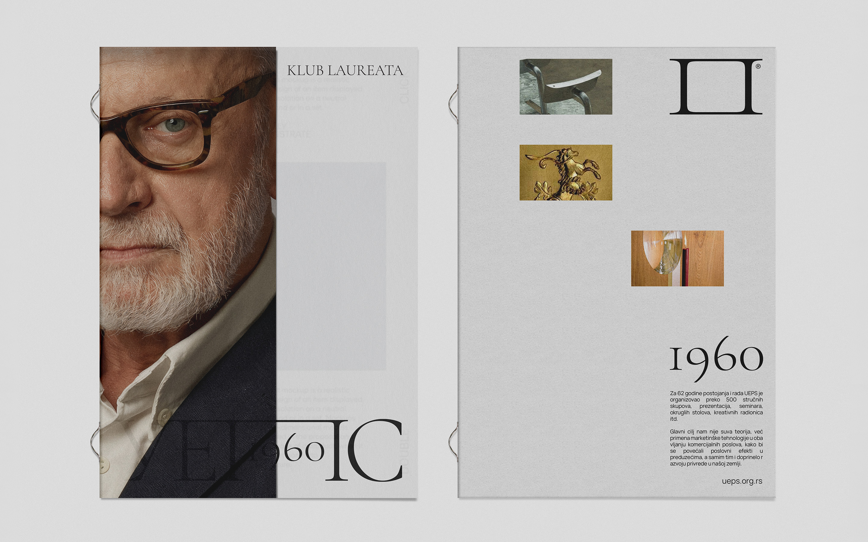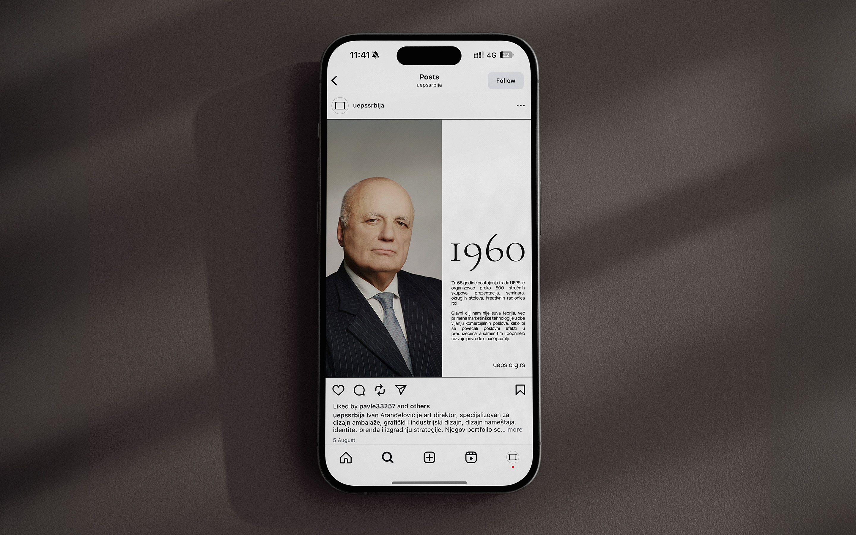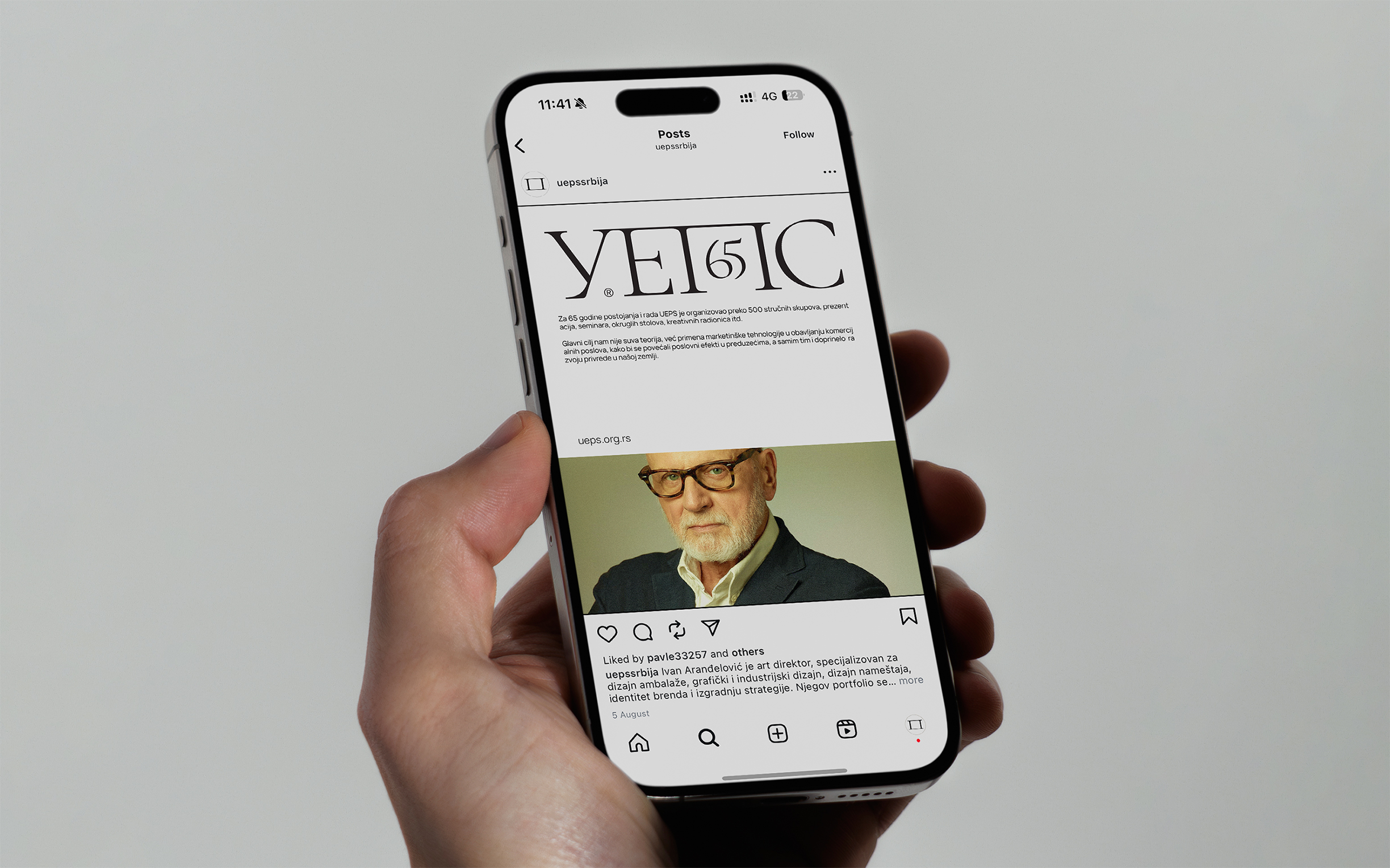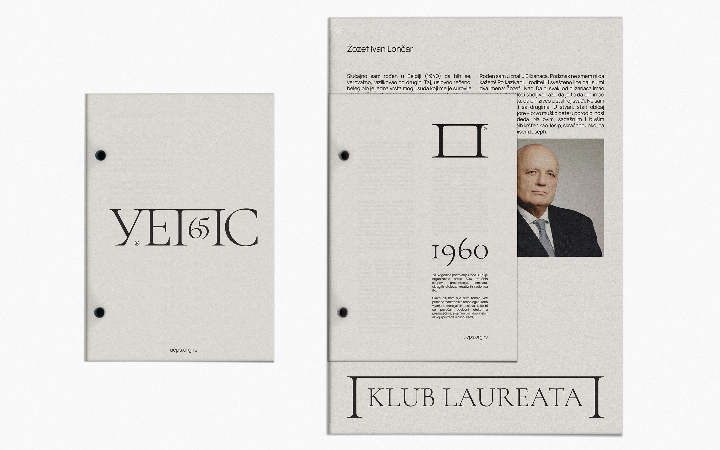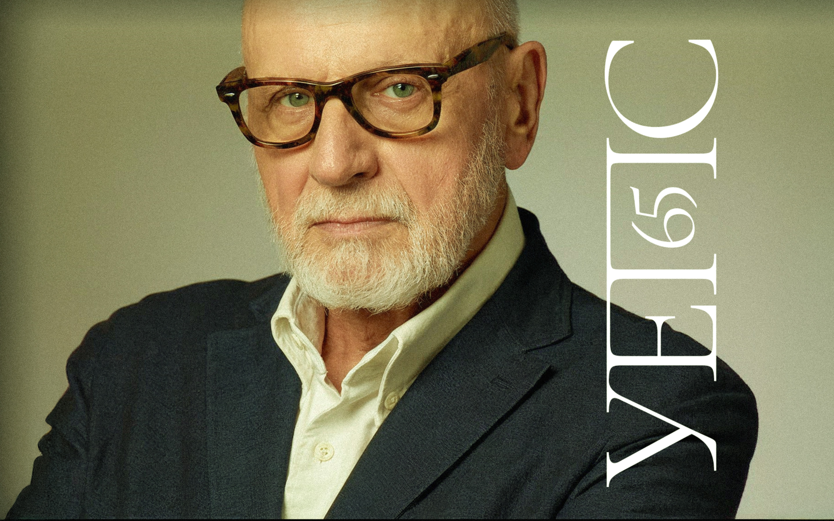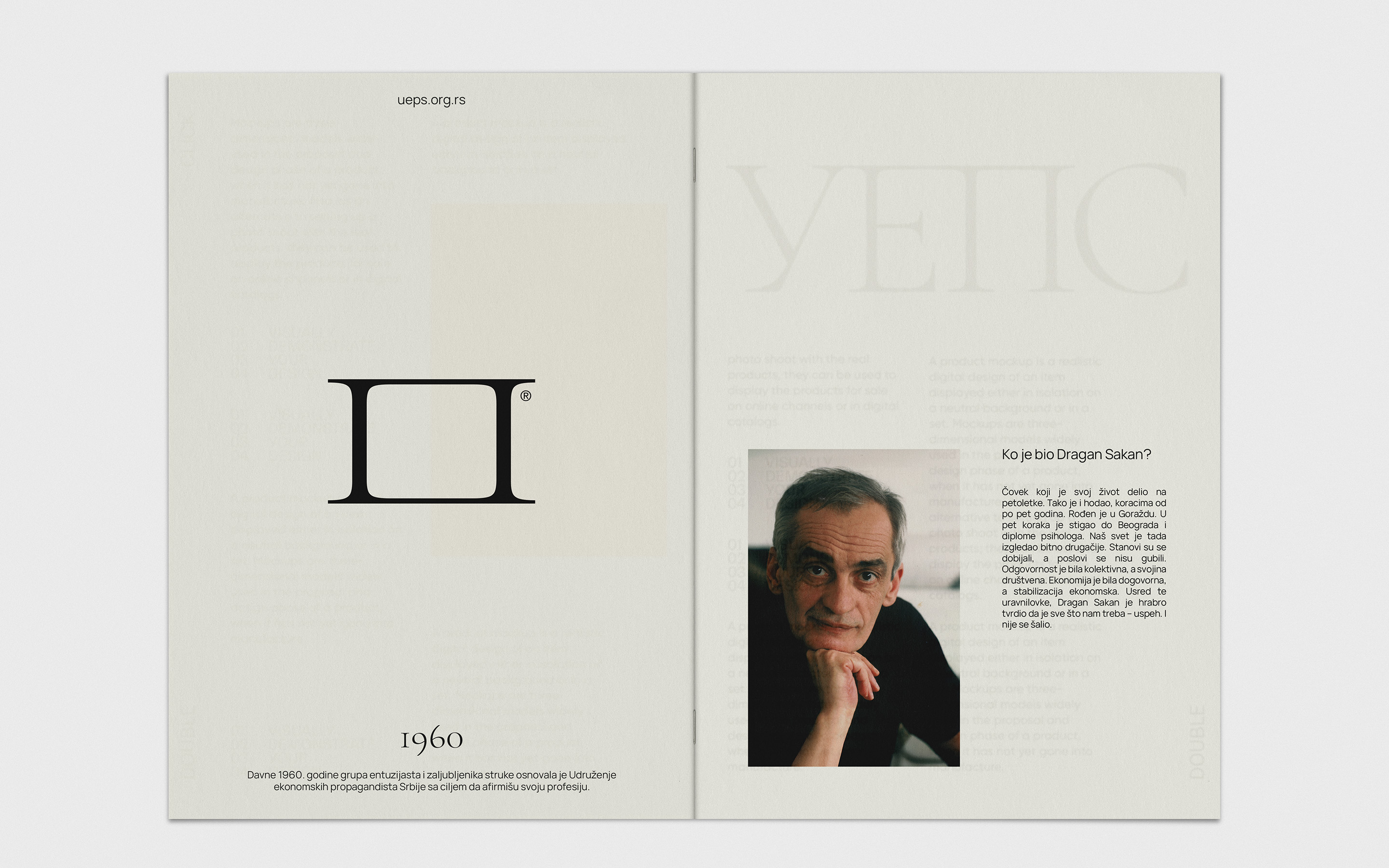
For the 65th anniversary of UEPS, the Serbian association of marketing and communications, I developed a refined typographic identity that treats the organisation as a living archive of its laureates.
Using the Cyrillic logotype as a structural frame, the system connects portraits, dates and stories of key figures who shaped the local industry. The result is a calm, editorial language that can stretch from awards materials to social media and exhibition graphics.
This direction was created for a competition and later evolved by the client; it is not the version ultimately implemented, but it remains my preferred approach and the one I chose to include in my portfolio.